
Museum of Vancouver
AR Experience Case Study
Here's an opportunity to highlight company news or a special service you offer in a way that stands out. Click to begin editing and customize the text to your needs.
Located in Vancouver, British Columbia, the Museum of Vancouver (MOV) is dedicated to preserving and showcasing the history and cultural heritage of Vancouver. They feature a variety of engaging and interactive exhibits that explore the city's past, present, and future, covering topics such as indigenous history, urban development, and social issues.
discovery
PROBLEM STATEMENT
Galleries and museums lack universal accessibility, excluding many individuals from engaging with art and cultural exhibits, resulting in limited cultural opportunities and reduced inclusivity.
CONDUCTING THE RESEARCH
Along with a competitor analysis, the team and I surveyed participants ages 22 - 55 to better understand why people opt out of visiting museums and what pain points they experience.
Reading info plaques became an apparent pain point for museum goers.
Everyone surveyed rated their comfort with technology very high which inspired us to create a tech-savvy solution.
I visited the museum and found that the atmosphere was too dark and that made it difficult to read the plaques. As someone with a vision impairment, the spotlight shining on the white font color also made the information difficult to read.
Gathering Key Insights
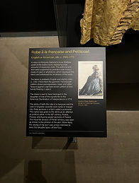
“The plaques in museums are too small for me to read”
— Name, Title

“I adore going alone, sitting in silence, reading all the descriptions.”
— Name, Title

How might we enhance accessibility and education for a wider audience in museums and art gallier


I had participants test our design with no direction other than to perform one task. I asked them to be vocal of the process and observed their navigation. I wanted to know:
WHICH ASPECTS NEED MORE CLARITY?
WHAT WOULD MAKE THE EXPERIENCE MORE IMMERSIVE?
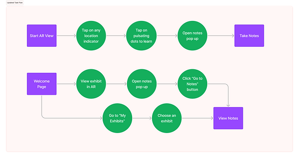
user testing & iterating
Issue #1
The wording needed to be improved. Users were not sure whether to go to “Visit”, “Explore” or “Learn”.
First, we opted to minimize the amount of buttons and to give each distinct wording, then we made the explore page the home page to eliminate the need for an extra screen.
Issue #2
Information hierarchy needed improvement. Call to Action button should be bigger and more visible.
CTA button was enlarged, brightened, and given a drop shadow to draw attention.
Issue #3
Users wanted more interactions to enhance the overall experience. A lot of the information was lorem ipsum. Opt for content first design taken directly from the website.
I replaced the placeholder text and images with content directly from the site and our own museum visit experience as part of content first design. I also added AR components to our images that animate for additional interactivity.
next steps
Second round of user tests and incorporate feedback on the notes feature
Expand the app, continue to build the "Profile" and "Connect" tab
Implementing more interactivity and motion into the AR elements